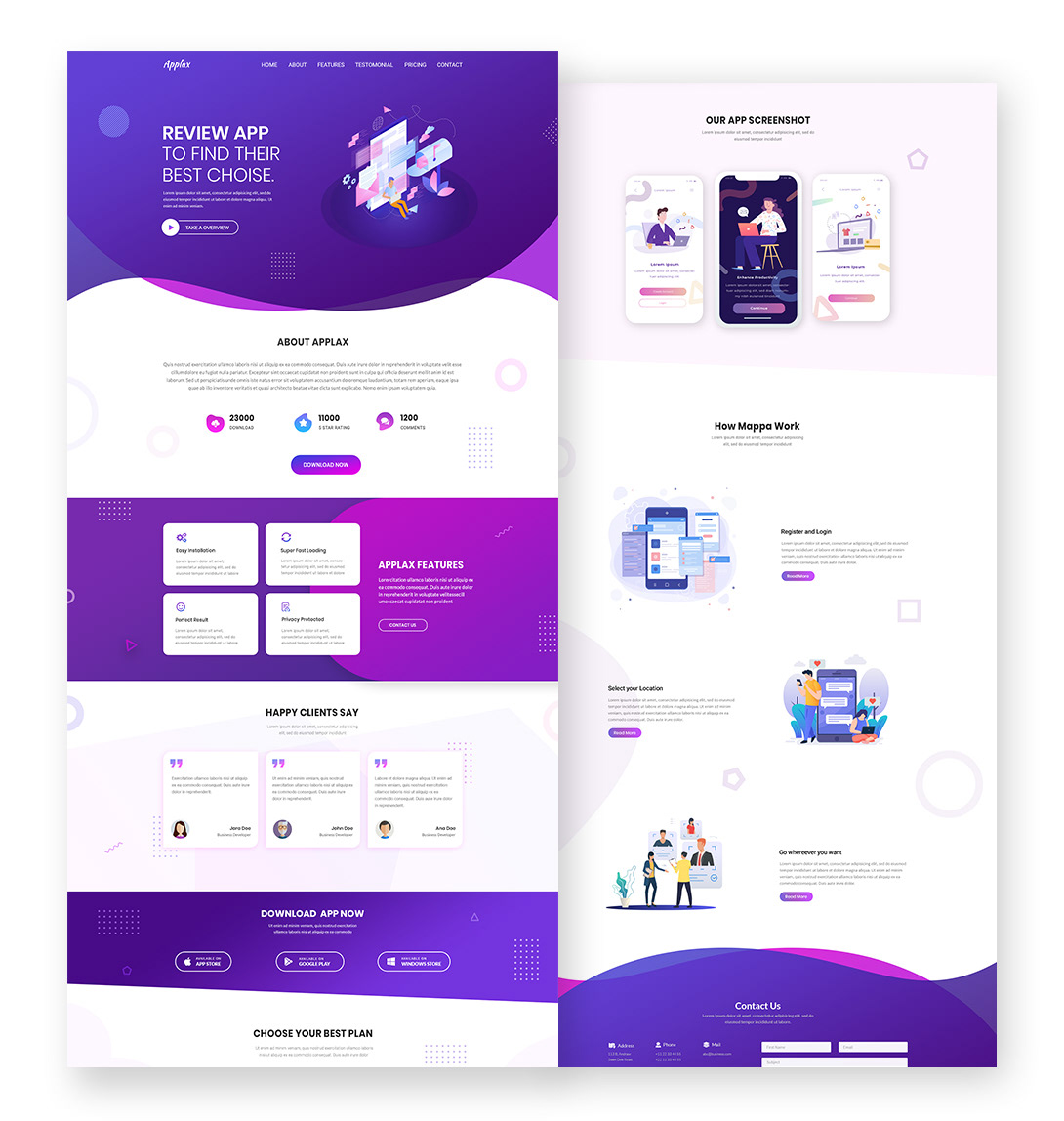
The Psychology of Color in User Experience Design
The psychology of color plays a crucial role in user experience design, as it significantly affects how users perceive and interact with digital interfaces. Different colors evoke various emotions and feelings, influencing decision-making processes and overall user satisfaction. For instance, warm colors such as red and yellow can create a sense of urgency, making them effective for call-to-action buttons, while cool colors like blue and green often promote tranquility and trust, suitable for financial or healthcare-related websites.
Incorporating the principles of color psychology into design decisions can lead to improved usability and better engagement rates. Designers can implement color theory in a variety of ways, such as through color contrast to ensure readability, or using complementary colors to create a harmonious visual experience. Ultimately, understanding how colors affect user emotions helps create interfaces that not only attract users but also enhance their overall experience on the platform.
10 Essential Principles of Effective UX/UI Design
User experience (UX) and user interface (UI) design are critical components of any digital product. Effective UX/UI design enhances usability, improves accessibility, and ultimately leads to user satisfaction. Here are the 10 essential principles to consider:
- Consistency: Ensure that design elements are uniform across the platform.
- Feedback: Provide users with feedback on their actions to enhance interactivity.
- Hierarchy: Use visual hierarchy to guide users' attention to important elements.
- Simplicity: Strive for simplicity in design to avoid overwhelming the user.
- Accessibility: Design for inclusivity, considering the needs of all users.
The latter half of effective UX/UI design principles includes:
- Typography: Choose readable fonts that fit the overall design aesthetic.
- Color: Use color strategically to evoke emotions and guide actions.
- Testability: Regularly test designs with real users to gather valuable insights.
- Flexibility: Create designs that adapt to various devices and screen sizes.
- Emotional Connection: Aim to build a connection with users through relatable design elements.
How to Create Intuitive User Interfaces that Delight Users
Creating intuitive user interfaces is essential for ensuring a seamless user experience. To achieve this, start by understanding the needs and behaviors of your target audience. Conduct user research through surveys or usability testing to gather insights. Once you have a clear understanding, utilize design principles that promote clarity and ease of navigation. For example, employ consistent layout patterns, intuitive iconography, and simple language that resonates with your users. By prioritizing user-centered design, you set the foundation for interfaces that not only meet user expectations but also enhance satisfaction.
Next, it’s important to incorporate feedback mechanisms within your user interfaces. Users should feel a sense of control and engagement as they interact with your product. Use visual cues such as hover effects and animations to guide users’ actions, making their journey feel dynamic and responsive. Additionally, consider implementing feature highlights or onboarding tutorials aimed at showing users how to navigate effectively. By fostering a sense of delight through thoughtful design choices and responsive interfaces, you can create experiences that not only satisfy but also retain users, leading to long-term loyalty.
