Viva Resa: Your Gateway to Insightful Living
Discover news, trends, and tips for a vibrant lifestyle.
Font Follies: Why Your Website Deserves Better Typography
Transform your website's appeal! Discover why better typography is the key to captivating your audience and boosting engagement.
The Impact of Typography on User Experience: Why It Matters
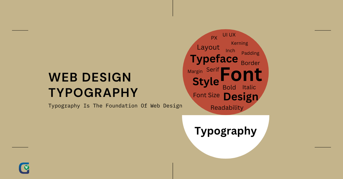
Typography plays a crucial role in shaping user experience on digital platforms. The choice of font, size, spacing, and color not only influences the aesthetic appeal of a website but also impacts readability and accessibility. For instance, using fonts that are too decorative or difficult to read can frustrate users, leading to increased bounce rates. A well-structured typographic hierarchy helps guide the user's eye, making it easier to scan text quickly. This is especially important in today’s fast-paced world where users often skim content rather than reading it in detail.
Moreover, typography impacts brand perception and can convey subtleties about the nature of a product or service. For instance, a clean and modern typeface can suggest innovation, while a serif font might evoke tradition and reliability. Consistency in typography across a site reinforces branding and fosters trust among users. As such, investing time in designing a thoughtful typographic system is not just a matter of aesthetics but is also integral to enhancing user engagement and satisfaction.

Common Typography Mistakes That Can Hurt Your Website
Typography plays a crucial role in the overall aesthetic and functionality of your website. However, common typography mistakes can hurt your website's user experience and SEO performance. One of the most prevalent issues is the use of inconsistent font sizes. When different headings and body text have non-uniform sizes, it creates confusion, making it difficult for visitors to navigate and absorb the content. Always ensure a coherent hierarchy by utilizing a structured approach, like employing CSS styles to define sizes explicitly and maintain consistency throughout your site.
Another common typography mistake involves poor line spacing or leading. When lines of text are too close together or too far apart, it can lead to readability issues, driving users away from your site. A good rule of thumb is to set your line-height to around 1.5 times the font size, which enhances clarity and makes reading more comfortable. Additionally, using contrast effectively is vital; ensure your text color stands out against the background to prevent eye strain and further improve user engagement.
How to Choose the Right Fonts for Your Brand Identity
Choosing the right fonts for your brand identity is crucial in establishing a memorable and cohesive image. Start by understanding your brand's personality—whether it's modern, traditional, playful, or elegant. Consider the emotions you want to evoke in your audience. For example, a tech company might opt for sleek, sans-serif fonts that convey innovation, while a luxury brand might choose a classic serif font that reflects sophistication. It's also important to ensure that your font choice is versatile and works well across various platforms and sizes.
Once you have a clear understanding of your brand identity, create a short list of potential font options. Test these choices in practical scenarios, such as in branding materials, social media graphics, and web design. Don’t forget to consider font pairing; using a combination of different fonts can help create visual interest while maintaining harmony. For instance, you might pair a bold display font with a clean, minimalist text font for contrast. Ultimately, the right fonts should complement your brand's message and enhance its overall identity.